We begin with brand essence
We define what the business stands for, how it wants to be perceived, who it speaks to and what differentiation deserves to be highlighted. Without that strategic base, even a beautiful outcome remains superficial.
BRANDING & IDENTITY
Brand strategy, logo systems, typography, color direction, visual language and practical applications that work consistently from first impression to purchase.
HOW WE APPROACH IT
Branding is not just decoration. It is the translation of business positioning into a clear visual identity, the right message and a consistent experience across every touchpoint.
We define what the business stands for, how it wants to be perceived, who it speaks to and what differentiation deserves to be highlighted. Without that strategic base, even a beautiful outcome remains superficial.
We design a logo system that performs correctly on websites, social media, cards, printed materials, signage, presentations and packaging. We care not only about how it looks large, but how it behaves small, clean and memorable.
We develop a palette, typography, shapes, patterns, graphic cues and composition rules so the brand has a coherent identity rather than fragmented outputs that feel unrelated.
Branding is incomplete without a clear verbal layer. We define tone, vocabulary, promises and messaging direction so websites, social, ads and sales material speak in one voice.
We do not stop at conceptual mockups. We check how the identity behaves in the touchpoints that customers actually see, compare and use before making decisions.
The identity must support growth. That is why we structure brand assets and usage rules that allow the business to expand campaigns, content and new applications without losing consistency.
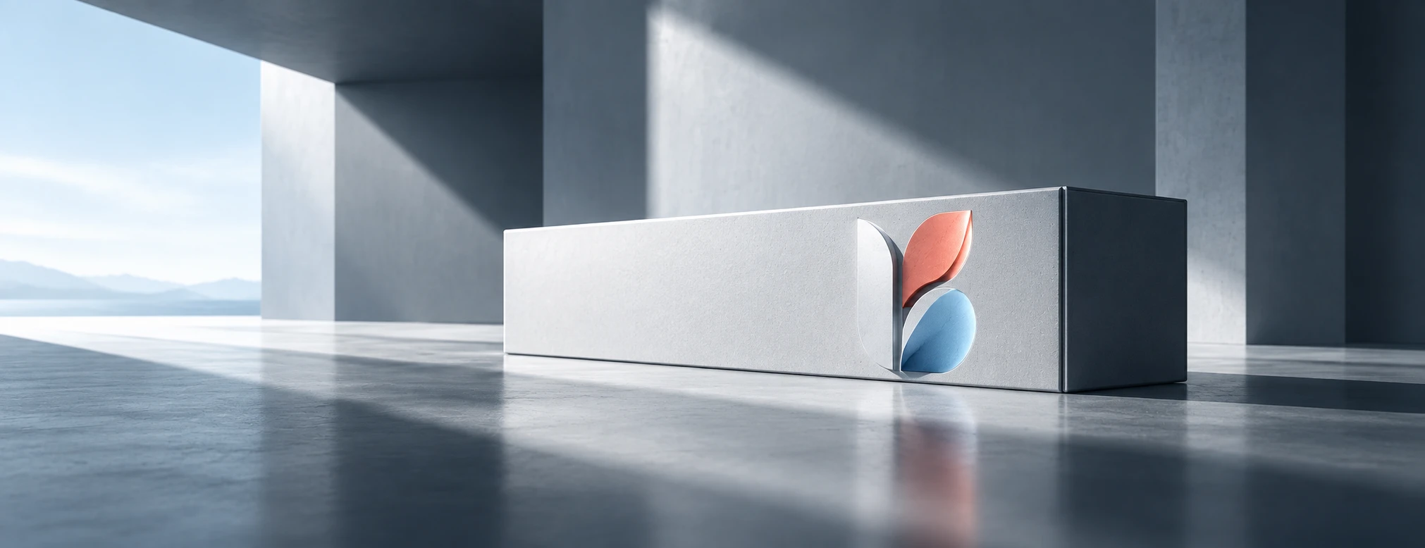
The deliverable is not a single logo file. It is a structured set of decisions and tools that helps a business appear coherent and professional everywhere.
We clarify how the business should be positioned in the market, what promise it makes and which strengths need to become more visible to the audience.
We build core and alternate logo versions for different uses: horizontal, stacked, icon-based, monochrome and small-scale applications.
Primary and supporting colors are defined with clear logic so the brand remains distinctive, readable and functional across digital and print environments.
We choose fonts and hierarchies for headings, body text, CTA and supporting information so communication feels clean, contemporary and easy to read.
We develop shapes, graphic cues, icon styles or supporting patterns that create coherence across posts, presentations, banners and communication material.
We gather the main usage rules so future materials can follow the same line and avoid drifting away from the identity.
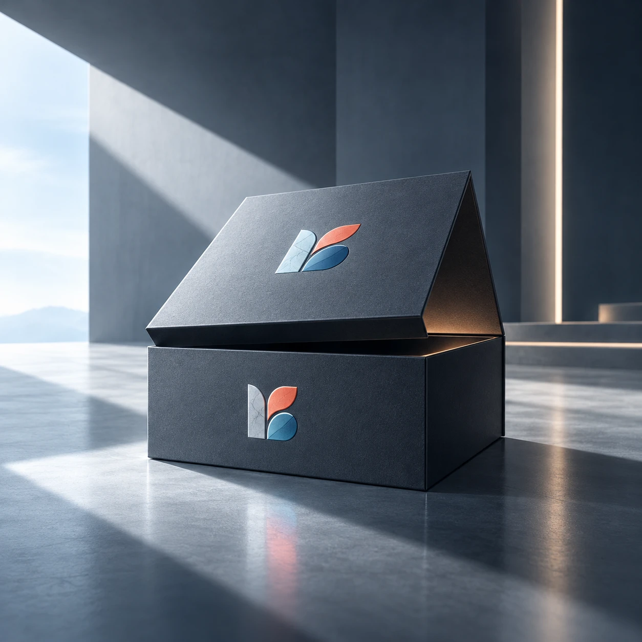
Below is a more premium, clean branding direction shown through packaging and branded objects, with emphasis on clarity, material quality and memorability.
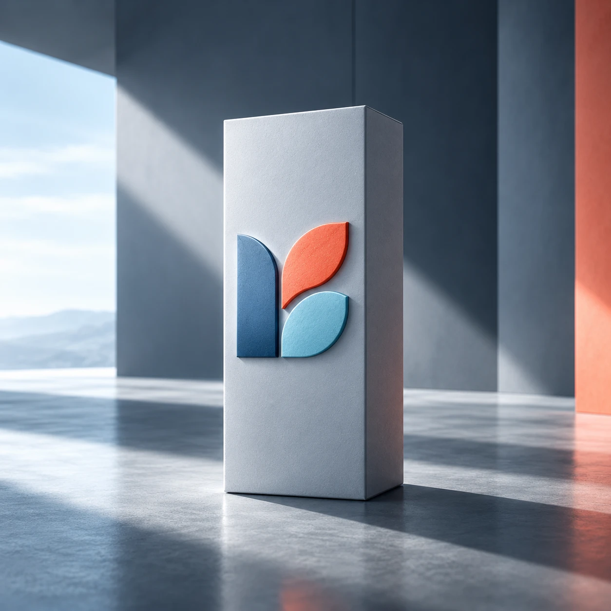
A clean and confident logo placement that helps the brand stay recognizable and easy to remember.
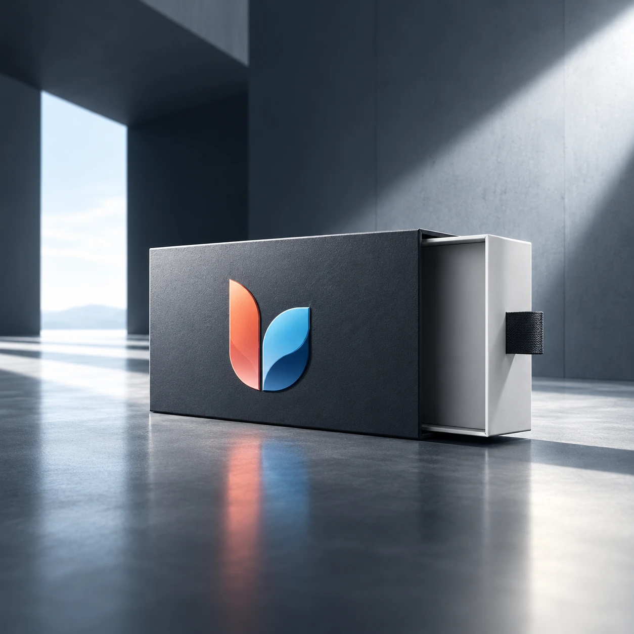
The identity must work even in more functional, technical or complex packaging formats.
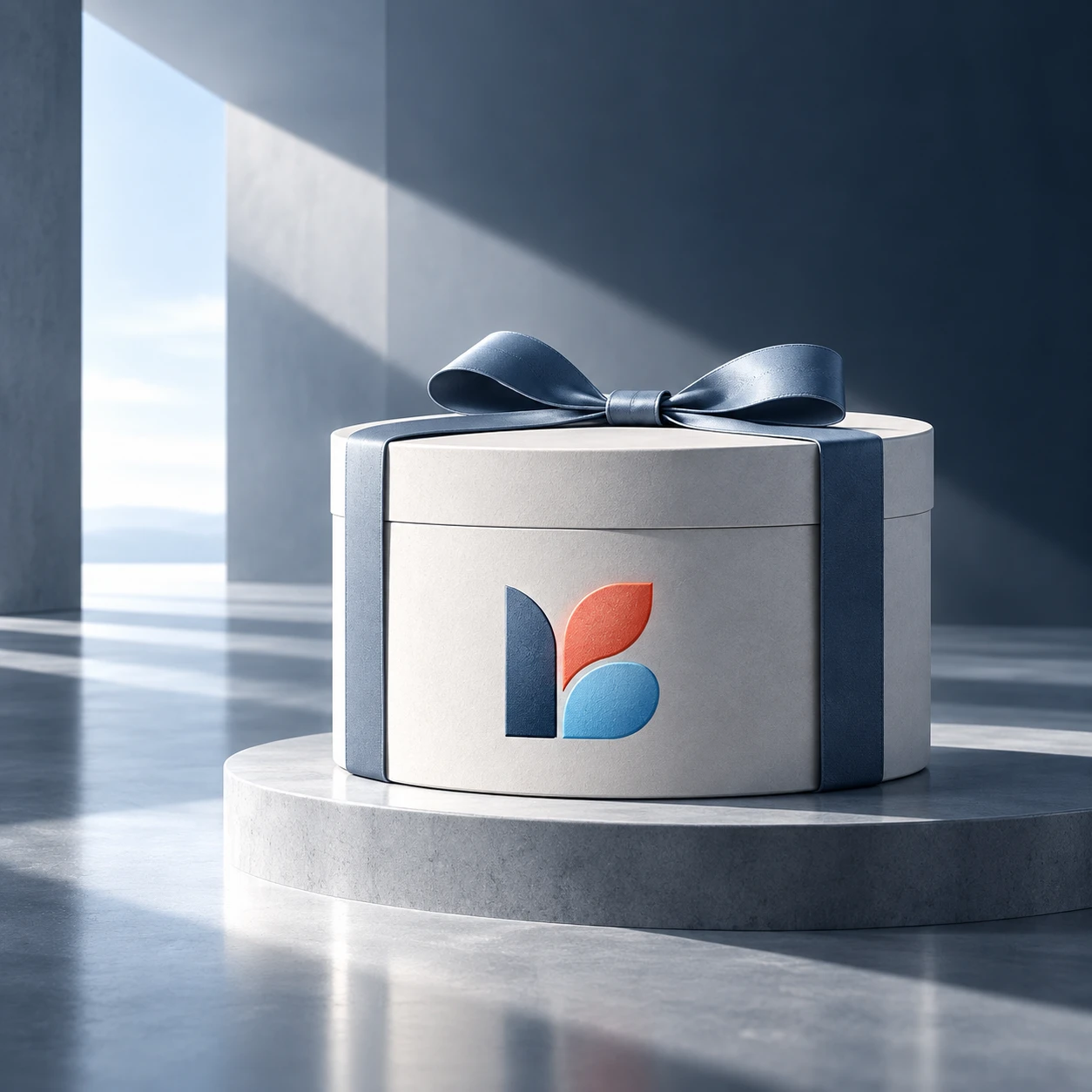
The identity extends into gift packaging, where emotion and perceived value need to be communicated instantly.
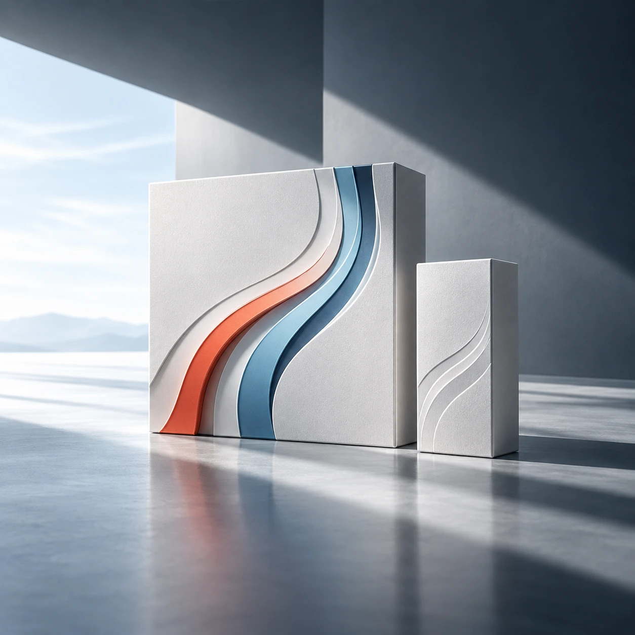
Shapes and graphic cues can become a recognisable visual language even when the full logo is not always present.
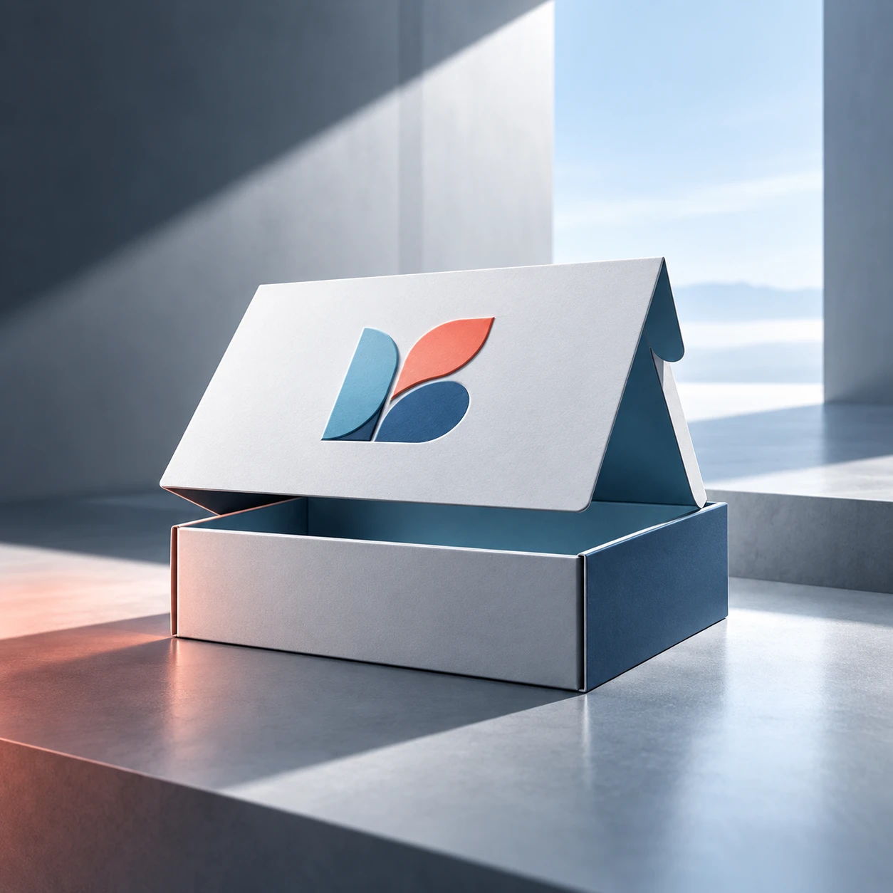
Delivery and product opening are now part of the brand experience, so identity needs to perform in physical touchpoints too.
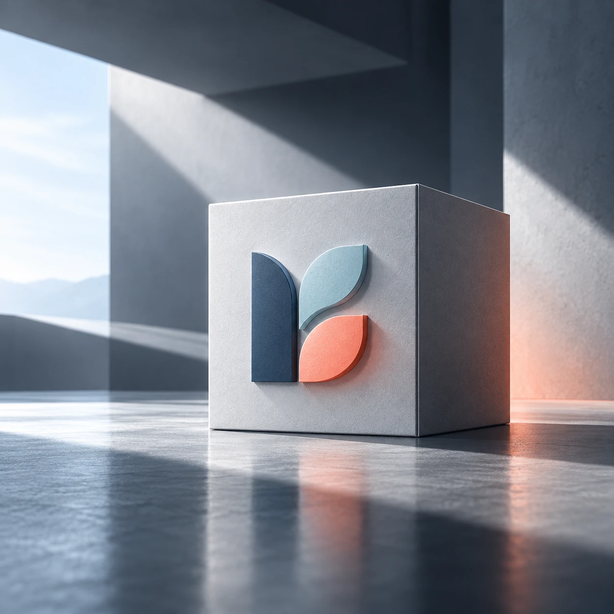
When different categories or ranges exist, the brand system should allow distinction without losing the common identity.

A branding project is successful only when it translates well into day-to-day use and helps the business appear more serious, more organised and more trustworthy.
This is where alignment between colors, hierarchy, message, CTA and overall user experience becomes visible. The brand should support clarity and trust.
The identity should remain recognizable even in fast scrolling environments. That is why we shape templates, visual direction and usage rules for posts, reels and ads.
Packaging, cards, labels, flyers, printed pieces and corporate materials are critical touchpoints where the brand gains material presence and reinforces quality perception.
Offer decks, presentations, documents and sales proposals should follow the same logic so every interaction builds trust and consistency.
IN PRACTICE
A well-structured branding project helps a business look more organised, more mature and more credible. It clarifies the message, improves first impression and strengthens recognition across channels.
ADDED VALUE
Branding is not an isolated exercise. When built correctly, it improves website perception, gives social content more structure, strengthens advertising creatives and creates a more stable customer journey end to end.
Mapping the current image, audience and goals of the business.
Turning strategy into logo, visual language, messaging and practical applications.
Delivering a direction that can be used in day-to-day marketing and sales activity.
PROCESS
We gather information about the market, competition, business goals, current image and practical needs.
We define positioning, brand message, tone and the visual routes worth pursuing.
We build the logo, palette, typography, core identity elements and primary applications with consistency.
We organise the output so it can be used properly across websites, social, packaging and sales communication.
Strong branding is not decorative spending. It is an investment that improves perceived value, recognition and consistency in everyday communication.
Your audience understands more quickly what the business represents and why it deserves attention.
Website, social, presentations, packaging and proposals start to feel like parts of the same business instead of disconnected outputs.
When rules and assets exist, day-to-day content creation becomes quicker and easier to control.
The business appears more organised and professional, which positively affects trust, sales conversations and overall perception.
QUICK ENQUIRY
Leave your name and phone number. The form includes a simple 4-digit security check and creates no obligation.
F.A.Q.
That depends on the real need. In some cases a full strategic and visual reset is necessary, while in others an improved system and better implementation of the existing brand is enough.
Yes. That is the right way to approach it. The identity should translate directly into the website, social content, advertising, presentations and physical material.
Yes. We organise the files and the key usage rules so the brand can be applied correctly and consistently.
It does not replace the product or a sales strategy, but it strongly improves perception, trust and value communication, which directly influence customer decisions.
We begin with an evaluation and a clear order of priorities.